
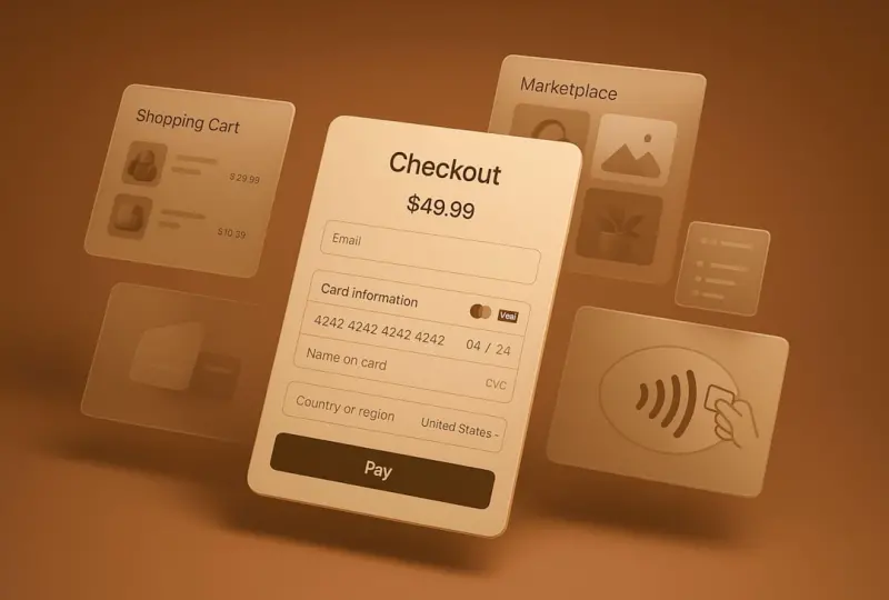
Why the Real Battle Begins After the “Thank You” Page
Most ecommerce teams obsess over the perfect product page, a frictionless checkout, and a dazzling home‑page carousel. Yet, the moment a shopper clicks “Place Order,” the real opportunity to build loyalty and increase lifetime value begins. The post‑purchase phase is a quiet, often overlooked stage where design can either deepen the relationship or let it drift away.
Redefining Post‑Purchase: From Transaction to Relationship
Think of the post‑purchase journey as a three‑act play:
- Act 1 – Confirmation & Anticipation: The order‑confirmation page and the first email set the tone for the experience to come.
- Act 2 – Arrival & Unboxing: The moment the package lands on the customer’s doorstep is a high‑stakes sensory moment.
- Act 3 – Integration & Advocacy: How the product fits into the buyer’s life, and whether they become a brand advocate.
Each act presents design challenges that go far beyond traditional UI considerations. By treating them as distinct experiences, you can engineer moments that feel personal, delightful, and unforgettable.
1. The Power of Sensory Design in Digital Interactions
Our brains process more than just visual cues. Sound, motion, and even subtle haptic feedback can reinforce trust and excitement. Here’s how to weave these senses into the post‑purchase flow:
Sound as a Confirmation Cue
A soft “ding” or a pleasant chime when an order is confirmed can trigger a dopamine response, making the purchase feel rewarding. Choose a tone that aligns with your brand personality—minimalist for a tech‑savvy brand, warm and acoustic for a lifestyle label.
Micro‑Motion that Guides the Eye
While the Micro‑Interactions: The Unsung Heroes of Modern Ecommerce Design post covered motion in the checkout, extending subtle animations to the confirmation page (e.g., a progress bar that “fills” as the order processes) keeps the user engaged while they wait.
Haptic Feedback for Mobile Users
On smartphones, a gentle vibration when a shipping update arrives reinforces the message without demanding visual attention. This is especially valuable for users who are on the go and may glance at notifications only briefly.
2. Personalization That Feels Personal
Generic “Your order is on its way” emails are a missed chance. Modern ecommerce platforms can deliver dynamic, data‑driven content that feels handcrafted.
Dynamic Order Summaries
Instead of a static list, show product recommendations based on the purchased items, styled with the same visual language as the original product page. This continuity subtly encourages cross‑sell without feeling pushy.
Location‑Based Delivery Estimates
Integrate real‑time logistics data to display a live map of the package’s journey. A tiny animation of the parcel moving across a map not only informs but also builds anticipation.
Personalized Thank‑You Videos
Even a 10‑second video that addresses the buyer by name and showcases the product in use can dramatically boost post‑purchase sentiment. It’s a scalable way to add a human touch.
3. Unboxing as a Designed Experience
The physical unboxing is a sensory event that can reinforce brand identity. Design your packaging with the following principles in mind:
- Brand Consistency: Use colors, typography, and textures that echo your digital presence.
- Surprise Elements: Include a handwritten note, a QR code to a “how‑to” video, or a small freebie that encourages social sharing.
- Eco‑Friendly Messaging: If you’ve invested in sustainable packaging, highlight it—customers love to showcase environmentally responsible purchases.
4. Turning Customers into Advocates
Advocacy doesn’t happen by accident; it’s a design outcome. Here are three proven tactics:
Seamless Review Collection
After delivery, prompt the buyer with a one‑click review modal that pre‑populates the product name and allows star ratings, photos, and short text. Make the UI so frictionless that the barrier to leaving a review is near‑zero.
Community Hubs
Invite purchasers to a private community where they can share tips, ask questions, and showcase their product in real life. This creates a sense of belonging and drives organic word‑of‑mouth.
Loyalty Loops Integrated Into the UI
Show points earned, upcoming rewards, and exclusive offers directly on the order‑status page. Visual progress bars that fill as points accumulate give a gamified feel that encourages repeat purchases.
5. Data‑Driven Iteration: Measuring the Post‑Purchase Funnel
Design decisions must be validated. Track these key metrics:
- Confirmation Email Open Rate: Indicates if your subject line and timing resonate.
- Delivery Notification Click‑Through: Shows engagement with tracking updates.
- Unboxing Social Shares: Measure the volume of user‑generated content featuring your packaging.
- Post‑Purchase Review Rate: Reflects how easy you’ve made the feedback loop.
- Repeat Purchase Frequency: The ultimate KPI for loyalty design.
Use A/B testing to experiment with different sounds, animations, and messaging. Even subtle changes—like swapping a flat “Thank you” banner for a animated celebration—can lift conversion metrics by several percentage points.
6. Practical Checklist for a Killer Post‑Purchase Experience
- Confirmation Page
- Clear order summary with product thumbnails.
- Animated progress indicator for order processing.
- Subtle confirmation sound that matches brand tone.
- Email Sequence
- Immediate order receipt with dynamic product recommendations.
- Mid‑shipping update featuring a live map and haptic notification for mobile.
- Post‑delivery “How to Use” video personalized with the buyer’s name.
- Packaging Design
- Brand‑consistent colors and typography.
- Eco‑friendly materials highlighted on the inner flap.
- QR code linking to an exclusive unboxing video.
- Advocacy Hooks
- One‑click review modal sent 48 hours after delivery.
- Invite to a private community or brand ambassador program.
- Loyalty points displayed prominently on the order status page.
7. Real‑World Example: A Boutique Skincare Brand
Consider a small skincare brand that implemented the above principles:
- They added a soft chime on order confirmation and an animated “Your skincare journey starts now” banner.
- The follow‑up email included a short, personalized video showing the founder explaining the product’s benefits.
- Packaging featured a biodegradable sleeve with a printed QR code that opened a “How to Apply” tutorial.
- Two days after delivery, a one‑tap review request yielded a 23 % response rate, and 15 % of reviewers posted their unboxing on Instagram, tagging the brand.
- Within three months, repeat purchase frequency rose from 12 % to 27 %.
This case underscores how design choices that extend beyond the screen can translate into tangible revenue growth.
Conclusion: Design Is the Bridge From Purchase to Loyalty
The post‑purchase experience is the most powerful, yet under‑engineered, phase of ecommerce design. By applying sensory cues, hyper‑personalized communication, thoughtful packaging, and community‑building mechanics, you transform a one‑time transaction into a lasting relationship. Remember: the checkout is just the beginning—design the moments after, and you’ll watch customers evolve into enthusiastic brand advocates.

Brad Hays is a freelance writer known for his versatile skill set and ability to craft compelling content across a wide range of industries.
Related Posts
Design Systems: Building Scalable, Consistent Ecommerce Experiences
Explore why a robust design system is essential for modern ecommerce, covering tokens, component lib... Read More
Leveling Up: How Gamified Shopping Journeys Are Redefining Ecommerce Design
Gamified shopping turns routine clicks into playful adventures, using points, quests, and leaderboar... Read More

Crafting Trust: Visual Design Tactics That Convert Shoppers
This post reveals how strategic visual cues—security badges, consistent branding, rich product ima... Read More
Top Posts

Taking Back the Reins: The Power of Self‑Hosted Commerce
Self‑hosted ecommerce empowers brands with full control over their tech stack, robust security, and predictable costs, enabling truly differentiated customer ...Read More
Serverless Commerce: Redefining Ecommerce Development for Agility and Cost Efficiency
Serverless commerce replaces heavyweight servers with on‑demand functions, offering faster time‑to‑market, automatic scaling, and significant cost savings...Read More

Inclusive Ecommerce Design: Making Shopping Accessible for All
A deep dive into why accessibility matters in ecommerce, practical design strategies, and how inclusive UI can turn browsers into loyal customers....Read More
Turning One‑Time Buyers into Lifetime Partners with Subscription Commerce
Subscription commerce transforms one‑off transactions into lasting partnerships. This post outlines the key pillars, architectural choices, and actionable tac...Read More
0 Comments
Post Comment
You will need to Login or Register to comment on this post!