
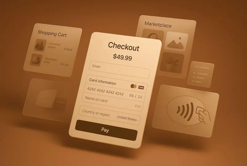
Why Cognitive Load Matters in Modern Ecommerce
When shoppers land on a product page, their brains are already juggling a dozen subconscious decisions: Is this product relevant?Do I trust this brand?Can I afford it? Add a complex checkout flow into the mix and you’ve turned a simple purchase into a mental marathon. The result? Cart abandonment, lower conversion rates, and a brand reputation that feels “hard to work with.”
Design isn’t just about pretty colors and slick animations; it’s about reducing friction for the human mind. By treating every interaction as a cognitive load budget, we can design ecommerce experiences that feel effortless, trustworthy, and, most importantly, purchasable.
Deconstructing the Checkout Funnel: From Intent to Confirmation
The classic ecommerce funnel—product view → add‑to‑cart → checkout → payment → confirmation—looks linear on paper, but in reality each stage is a series of micro‑tasks that compete for the shopper’s attention. Let’s break down the hidden mental steps:
- Information Retrieval: Users must locate and understand pricing, shipping, and return policies.
- Decision Confirmation: They need reassurance that the selected product is still in stock and that the price hasn’t changed.
- Data Entry: Filling out forms for address, email, and payment details taxes working memory.
- Risk Assessment: Shoppers evaluate security cues, trust seals, and overall site credibility.
- Final Commitment: The “place order” button is the culmination of all previous mental work.
If any of these steps feels overwhelming, the brain will opt for the path of least resistance—usually leaving the site altogether.
Design Patterns That Lighten the Load
Below are proven design patterns that directly target the cognitive load at each stage of the funnel. They’re not gimmicks; they’re grounded in cognitive psychology and user‑centered design principles.
1. Progressive Disclosure
Instead of presenting every form field on a single page, reveal information as it becomes relevant. For example, only ask for a phone number after the user selects a shipping method that requires it. This keeps the visual field clean and reduces the perceived effort.
2. Inline Validation & Real‑Time Feedback
When a user types an address, instantly flag errors or suggest auto‑complete options. Real‑time feedback eliminates the “Did I get that right?” anxiety that often causes abandonment at the payment step.
3. Visual Hierarchy for Priority Actions
Make the primary “Buy Now” or “Continue to Payment” button visually dominant. Use size, color contrast, and whitespace to guide the eye—building subtle trust cues like micro‑animations can also signal readiness without being distracting.
4. Contextual Trust Signals
Instead of a wall of generic badges at the bottom of the page, place security icons and guarantee statements next to the fields they protect. A lock icon next to the credit‑card input field, for instance, reassures users exactly where it matters.
5. One‑Click Guest Checkout
Allow shoppers to complete a purchase without forcing account creation. If you need to collect email for a receipt, use a simple modal that pops up after the payment is authorized, not before.
6. Adaptive Layouts for Device Context
Mobile users benefit from larger touch targets and collapsed menus, while desktop users appreciate side‑by‑side summaries. A responsive design that respects the device’s ergonomics reduces the mental gymnastics of scrolling and zooming.
7. Visual Cues That Align With Leveraging Visual Cues
Use product thumbnails, color swatches, and size diagrams that instantly convey the product’s attributes. When shoppers can see the exact variant they’re buying, they spend less time second‑guessing choices.
8. Modular Design for Consistency
Adopt a modular design approach that reuses UI components across the site. Consistency means users don’t have to relearn patterns on each page, freeing mental bandwidth for the purchase decision.
Practical Steps to Implement a Low‑Cognitive‑Load Checkout
Transforming theory into practice requires a systematic rollout. Here’s a step‑by‑step guide you can start using today.
- Audit Existing Forms: Map every field, note required vs optional, and calculate the average time to complete. Identify “friction hotspots” where users drop off.
- Prioritize Fields: Keep only essential information for the first step (email and shipping address). Defer secondary data (promo codes, gift messages) to later screens.
- Introduce Inline Validation: Implement JavaScript‑based checks that trigger after the user leaves a field, not on form submit.
- Design Visual Hierarchy: Use a design system to standardize button sizes, colors, and placement. Test contrast ratios for accessibility (WCAG AA minimum).
- Add Contextual Trust Icons: Place SSL lock, payment method logos, and money‑back guarantee text adjacent to the relevant form elements.
- Enable Guest Checkout: Offer a “Continue as Guest” button that bypasses the account creation screen. Capture email only for receipt delivery.
- Test Adaptive Layouts: Use responsive breakpoints to adjust input field width, button size, and spacing. Run usability tests on both mobile and desktop devices.
- Leverage Analytics: Track metrics such as time to complete checkout, field error rate, and conversion per device. Use these data points to iterate.
Measuring the Impact: From Intuition to Data
Design decisions are only as good as the results they produce. After implementing the low‑cognitive‑load patterns, set up a measurement framework:
- Conversion Rate Lift: Compare checkout completion before and after the redesign.
- Average Session Duration: A drop in checkout time often correlates with a smoother experience.
- Form Error Reduction: Track the number of validation errors per session.
- Net Promoter Score (NPS) for post‑purchase surveys: Ask shoppers if the checkout felt “easy” or “frustrating.”
- Heatmaps & Scroll Tracking: Visualize where users hesitate or abandon.
When you see a measurable reduction in abandonment and an uptick in repeat purchases, you’ve proven that easing cognitive load isn’t just good design—it’s a revenue driver.
Future‑Proofing Your Design for an Ever‑Changing Landscape
The ecommerce ecosystem evolves rapidly—new payment methods, emerging privacy regulations, and shifting consumer expectations all demand flexible design. To stay ahead:
- Adopt a Component‑First Design System that can be swapped out as new UI patterns emerge.
- Stay Informed on Accessibility Standards to ensure your low‑cognitive‑load approach remains inclusive.
- Iterate with A/B Testing on every major change, even minor tweaks to button copy or spacing.
- Monitor Emerging Research in neuro‑design and behavioral economics for fresh insights.
By making cognitive simplicity the cornerstone of your ecommerce design strategy, you’ll create experiences that feel natural rather than forced, turning browsers into loyal buyers—again and again.

Shawn DesRochers is a certified Microsoft technician and Programmer with 30+ year's experience. He has written many reviews on computer related products, software, and SEO related topics. When he's not writing reviews he can be found at one of the Ecommerce Directory which he is the CEO of.
Related Posts

Design Systems & Ops: The Secret Sauce Behind Scalable Ecommerce Experiences
A deep dive into why ecommerce teams need a design system backed by design ops, covering visual cons... Read More

Beyond the Screen: How Augmented Reality Is Reshaping Ecommerce Design
Augmented reality bridges the gap between digital product pages and real‑world experience, reducin... Read More

Designing for Cognitive Calm: Streamlining Online Shopping
Discover the power of cognitive calm in ecommerce design—using visual hierarchy, whitespace, progr... Read More
Top Posts

Adaptive Design: Future‑Proofing Ecommerce for Every Device
Adaptive ecommerce design goes beyond responsive breakpoints, using contextual layouts, device‑aware micro‑interactions, and data‑driven decision trees to...Read More

From Micro‑Moments to Macro‑Growth: A New Framework for Customer Engagement
A fresh, five‑stage engagement continuum shows how B2B SaaS firms can move beyond generic outreach, using behavioral segmentation, real‑time triggers, and u...Read More

Voice‑First Hosted Ecommerce: Turning Talk Into Transactions
Voice‑first commerce is the missing link for hosted ecommerce platforms. Learn how to integrate voice assistants, design conversational flows, and measure suc...Read More

AI‑Driven Account‑Based Commerce: Scaling Personalization for B2B
AI‑driven account‑based commerce uses predictive segmentation, dynamic pricing, and intent‑driven recommendations to deliver a personalized, scalable buyi...Read More
0 Comments
Post Comment
You will need to Login or Register to comment on this post!