
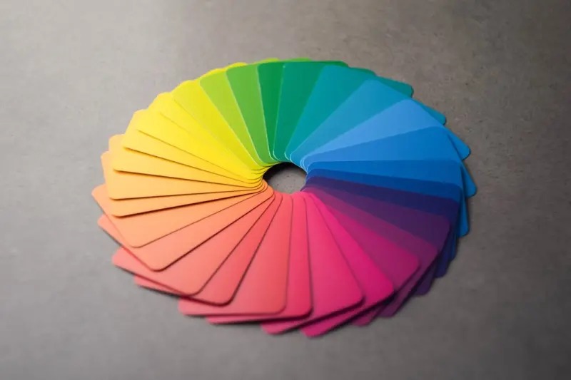
Why Color Isn’t Just Decoration—It’s Your Silent Salesperson
When I first walked into a physical storefront, I was hit by a wave of color that made me feel instantly comfortable—or, in some cases, uneasy. That visceral reaction isn’t magic; it’s science. In the digital realm, the same principles apply, only they’re amplified by the fact that users can’t touch or smell the product. The psychology of color becomes the silent salesperson that guides a shopper’s emotions, decisions, and ultimately, the bottom line.
The Neuroscience Behind the Palette
Our brains process visual information faster than any other sense. Within 200 milliseconds, a color cue can trigger an emotional response that bypasses rational analysis. Studies show that red can increase heart rate and create a sense of urgency—perfect for limited‑time offers. Blue, on the other hand, conveys trust and stability, making it ideal for checkout pages where users need reassurance.
But it’s not just about “red means sale.” Cultural context, brand personality, and even industry norms shape how a hue is interpreted. In the US, green often signals sustainability and growth, while in parts of Asia it can be associated with luck and prosperity. Understanding these nuances is the first step toward an emotion‑driven design strategy that feels authentic rather than manipulative.
Mapping Emotions to the Buyer Journey
Think of the ecommerce funnel as a story arc: awareness, consideration, decision, and loyalty. Each stage calls for a different emotional tone, and color is the brushstroke that paints it.
- Awareness (Discovery) – Bright, high‑contrast colors like orange or teal catch the eye in ad creatives and hero banners, prompting curiosity.
- Consideration (Research) – Muted, soothing shades such as soft blues or greys create a calm environment for product comparison.
- Decision (Purchase) – Strategic splashes of red or orange on CTA buttons inject urgency without overwhelming the user.
- Loyalty (Retention) – Warm, comforting colors like deep burgundy or forest green reinforce brand affinity in post‑purchase emails and loyalty dashboards.
When these emotional cues align with the user’s mental state, the conversion path feels natural rather than forced.
Practical Ways to Integrate Color Psychology
Below are actionable tactics you can embed directly into your design system without a complete overhaul.
1. Define a Core Palette Aligned With Brand Values
Start with a primary hue that embodies your brand promise—trust, excitement, sustainability, etc. Pair it with secondary shades that support specific funnel stages. Document these choices in a design system so developers and marketers stay on the same page.
2. Use Color to Prioritize Content
Apply accent colors sparingly to draw attention to high‑value elements: limited‑time discounts, free‑shipping thresholds, or stock‑level alerts. The key is contrast—make the CTA pop against a neutral background, but avoid the “neon” trap that can feel spammy.
3. Test, Iterate, and Personalize
Leverage A/B testing tools to compare how different color schemes affect metrics like click‑through rates, average order value, and bounce rate. Over time, you can feed these results into a dynamic theming engine that adapts the palette based on user preferences or even time of day.
4. Consider Accessibility From the Start
While we’re focusing on emotion, we can’t ignore usability. Ensure sufficient contrast ratios (WCAG AA minimum 4.5:1 for normal text) and provide alternative cues—icons, text labels, or animations—for color‑blind users. A well‑crafted color strategy can be both emotionally resonant and inclusive.
Case Study: A Boutique Apparel Store’s Color Overhaul
One of my recent clients, a boutique women’s apparel brand, relied heavily on pastel tones that matched their “soft” aesthetic. While beautiful, the palette didn’t convey urgency during flash sales, leading to missed revenue spikes.
We introduced a dual‑tone system: soft pastels for product pages (maintaining brand identity) and a bold, complementary orange for limited‑time banner strips and checkout CTA buttons. The results were striking:
- Conversion rate on flash‑sale pages jumped from 2.1% to 3.8%.
- Average order value increased by 12% thanks to better‑highlighted upsell modules.
- Customer satisfaction scores rose by 7 points, with feedback noting the “clear” and “energetic” sale experience.
This transformation illustrates how a few well‑placed color adjustments can shift the emotional tone without a full redesign.
Balancing Brand Consistency With Seasonal Flexibility
Seasonal campaigns (think “Spring Refresh” or “Holiday Sparkle”) often demand temporary color tweaks. The trick is to layer seasonal accents over your core palette rather than replace it entirely. For instance, a retailer might keep its signature blue as the foundation while introducing a rich gold for holiday hero images. This maintains brand recall while still feeling festive.
To manage this at scale, create a color token system within your design system. Tokens like --brand-primary, --season-accent, and --cta-background can be swapped out via a configuration file, ensuring developers never have to hunt through CSS for hard‑coded values.
Integrating Color Psychology With Emerging UI Patterns
Even as new interaction models—voice commerce, AR overlays, and micro‑interactions—gain traction, color remains a constant anchor. For example, ambient commerce experiences often lack visual context, so subtle color cues on accompanying UI panels become critical for grounding the user.
Similarly, when designing micro‑feedback animations (like “item added to cart” toast notifications), the color transition from neutral to celebratory green can reinforce the sense of accomplishment, nudging users toward further engagement.
Measuring the Impact: Metrics That Matter
Beyond raw conversion numbers, track these color‑specific KPIs:
- CTA Click‑Through Rate (CTR) – Compare the performance of buttons before and after color adjustments.
- Heatmap Concentration – Visualize where users linger; a well‑chosen accent should draw focus to high‑value zones.
- Time to Purchase – Faster decisions may indicate that the emotional cue effectively reduced friction.
- Return Visitor Ratio – Consistent emotional branding can boost loyalty, reflected in repeat visits.
Pair these quantitative insights with qualitative user interviews to capture the “why” behind the numbers.
Future‑Proofing Your Color Strategy
As AI‑driven personalization matures, we’ll see real‑time color adaptation based on individual mood detection (via webcam analysis or wearable data). While that sounds like sci‑fi, early experiments already demonstrate increased engagement when UI hues sync with a user’s emotional state.
Preparing for this future means keeping your color assets modular, investing in a robust low‑code platform that can push updates without developer bottlenecks, and fostering a culture of continuous experimentation.
Takeaway Checklist
- Identify the core emotion you want to evoke at each funnel stage.
- Map brand‑aligned primary colors to those emotions.
- Define secondary accent colors for urgency, trust, and celebration.
- Document everything in a design system for consistency.
- Run A/B tests and iterate based on both quantitative and qualitative data.
- Ensure accessibility compliance throughout.
- Plan for seasonal overlays without diluting core brand identity.
- Stay agile—use low‑code tools to roll out color updates quickly.
When you treat color as a strategic, emotion‑driven asset rather than a decorative afterthought, you give your ecommerce platform a silent yet powerful salesforce that works 24/7, across every device, and for every shopper.

Sanji Patel has dedicated 25 years to the SEO industry. As an expert SEO consultant for news publishers, he emphasizes providing both technical and editorial SEO services to news publishers worldwide. He frequently speaks at conferences and events globally and offers annual guest lectures at local universities.
Related Posts
Accessible Ecommerce Design: The Silent Sales Engine
Accessibility is the foundation of a high‑performing ecommerce site. This post explores practical,... Read More

Design Systems: The Unsung Hero Behind Consistent Ecommerce Experiences
A design system isn’t just a style guide—it’s a living library that unifies visual language, s... Read More

Emotion‑Driven Ecommerce Design: Color & Motion Hacks
Explore how strategic use of color, motion, and micro‑interactions can create emotionally resonant... Read More
Top Posts

Crafting Trust: Visual Design Tactics That Convert Shoppers
This post reveals how strategic visual cues—security badges, consistent branding, rich product imagery, reassuring microcopy, and performance—create a trust...Read More
Why Progressive Web Apps Are the Next Evolution in Ecommerce Development
Progressive web apps deliver app‑like speed, offline browsing, and push notifications for ecommerce sites, driving higher conversions and lower abandonment wh...Read More

Beyond Borders: Scaling Hosted Ecommerce for Global Audiences
A practical guide for merchants to turn a domestic hosted ecommerce site into a global revenue engine, covering language, currency, tax, payments, shipping, obs...Read More
Unlocking Hyper‑Personalized Omnichannel Experiences with Headless Commerce
A headless approach isn’t just a tech upgrade; it’s a catalyst for delivering truly personalized, cross‑channel shopping experiences that boost speed, con...Read More
0 Comments
Post Comment
You will need to Login or Register to comment on this post!