
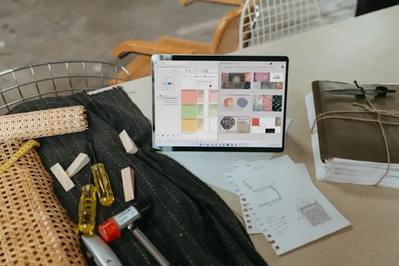
When Design Meets Emotion: Crafting Ecommerce Experiences That Feel Right
Every time I sit down to sketch a product page, I ask myself the same question: What will this make the shopper feel? In the noisy world of online retail, functionality alone no longer cuts it. Shoppers are drawn to experiences that whisper confidence, excitement, or even a quiet sense of belonging. This shift from pure usability to emotionally intelligent design is reshaping the ecommerce landscape, and it’s a conversation that’s still in its early chapters.
In my years of building B2B and B2C storefronts, I’ve watched design trends swing from flat minimalism to bold neomorphism, from static grids to kinetic scroll effects. Yet the common denominator in the most successful conversions is not a specific visual trend—it’s the emotional resonance that the design cultivates. Below, I’ll unpack three core principles that help you embed genuine feeling into every pixel of your store, and I’ll share actionable tactics you can deploy today.
1. Storytelling Architecture: Turning Catalogs into Narratives
Most ecommerce sites treat product listings like a library index—organized, searchable, and efficient. While that’s essential, it can feel sterile. Think of each category as a chapter in a larger brand story. When shoppers land on “Outdoor Gear,” they shouldn’t just see a list; they should feel the wind on a mountain trail, the anticipation of a sunrise hike, or the camaraderie of a campfire.
How do you build that narrative?
- Hero Sections with Contextual Imagery: Replace generic hero banners with lifestyle shots that depict the product in its natural environment. Pair these images with concise copy that paints a scene: “Gear up for the trail that calls your name.”
- Progressive Reveal: Instead of dumping the entire product grid at once, use subtle scroll‑triggered animations to unveil items one by one. This mimics the way a story unfolds, keeping the reader’s curiosity alive.
- Micro‑Story Cards: Attach a short anecdote or user‑generated snippet to each product—think of it as a tweet from an adventurer who just used the item. These real‑world touches make the catalog feel lived‑in.
When you frame a category as a narrative, you give shoppers a reason to stay, explore, and ultimately purchase because they’re buying into an experience, not just a SKU.
2. Color Psychology: The Subtle Persuader
Colors are the silent salespeople of a website. They influence mood, trust, urgency, and even perceived value. While many designers default to brand palettes, a deeper dive into color theory can unlock hidden conversion levers.
Here’s a quick cheat sheet:
- Blue: Conveys trust and reliability—ideal for checkout buttons or security badges.
- Orange & Red: Spark urgency and excitement—use sparingly on limited‑time offers.
- Green: Signals sustainability and calm—perfect for eco‑friendly product lines.
- Purple: Evokes luxury and creativity—great for premium collections.
But the magic happens when you layer these hues strategically. For example, a deep navy background can make a bright orange “Add to Cart” button pop, creating a visual hierarchy that guides the eye. Pair that with a subtle green accent in the product description to suggest “eco‑friendly value.” The result is a balanced emotional palette that nudges shoppers toward the desired action without feeling pushy.
3. Motion as Mood: Subtle Animation That Speaks Volumes
Animation isn’t just for delight; it’s a language of its own. A well‑timed slide, a gentle fade, or a responsive hover effect can convey confidence, responsiveness, and even brand personality. The key is restraint—over‑animated sites can feel chaotic and slow, eroding trust.
Consider these low‑effort, high‑impact motion techniques:
- Button Micro‑Press: When a shopper clicks “Buy Now,” let the button depress slightly and bounce back. This tactile feedback mimics a physical press, reinforcing the action.
- Loading Skeletons: Instead of a blank spinner, show grey outlines of the content that’s loading. It tells users that the page is actively building, reducing perceived wait time.
- Contextual Shift: When a user adds a product to the cart, animate the product image sliding into the mini‑cart icon. This visual cue confirms the action without a disruptive modal.
These motions create a sense of dialogue between the interface and the user, making the digital experience feel more human.
4. Trust‑Centric Visual Cues
Emotion and trust are two sides of the same coin. Even the most beautiful design can fall flat if shoppers doubt the transaction’s safety. Visual trust cues—like security seals, verified reviews, and transparent pricing—must be woven seamlessly into the design language.
Rather than tucking a SSL badge in the footer, integrate it into the checkout flow where the decision is made. Use a concise “Secure Checkout” badge next to the payment button, complemented by a short line about encryption. Pair this with a real‑time inventory indicator (“Only 3 left in stock”) to convey scarcity without resorting to high‑pressure tactics.
When trust cues feel like an afterthought, users notice. When they’re part of the visual rhythm, they become invisible—yet powerful.
5. Personalization Without Intrusion
Personalized experiences are no longer a novelty; they’re an expectation. However, there’s a thin line between helpful relevance and creepy overreach. The sweet spot lies in using data to enhance emotion, not replace it.
Start with contextual greetings (“Welcome back, Alex”) paired with a curated “Recommended for You” carousel that reflects recent browsing behavior. Then, add an emotional layer: a banner that says, “We thought you’d love this new shade—just in time for summer.” The phrasing acknowledges the user’s history while adding a personal, caring tone.
For deeper personalization, consider dynamic theming. If a returning shopper frequently browses minimalist products, subtly shift the UI’s whitespace and typography to mirror that aesthetic during their session. This invisible alignment reinforces the feeling that the site “gets” them.
6. The After‑Purchase Experience: Extending Emotion Beyond the Cart
Most brands stop the conversation once the order confirmation appears. Yet the post‑purchase window is a prime moment to deepen emotional bonds. Think of the order confirmation email not as a receipt, but as a continuation of the story you began on the product page.
Ideas to enrich this phase:
- Animated Thank‑You Videos: A short, branded clip that thanks the shopper and teases the unboxing experience.
- Story‑Driven Shipping Updates: Replace generic “Your order is on the way” text with a narrative like, “Your adventure gear is now packing for the trail.”
- Community Invitation: Include a call‑to‑action to join a user community or share their upcoming experience on social media, reinforcing a sense of belonging.
When the emotional thread continues after the sale, you lay the groundwork for repeat purchases and brand advocacy.
7. Leveraging Existing Knowledge Bases
If you’re looking for concrete frameworks to keep your design process scalable while still infusing emotion, you’ll want to revisit the foundations of a robust design system. While many think of design systems as purely technical, they can also serve as a repository for emotional guidelines—tone, color intent, motion principles, and storytelling templates—all codified for consistency across teams.
Our own deep dive into design systems shows how aligning visual language with brand personality creates a repeatable, emotion‑driven workflow. By embedding emotional directives directly into component libraries, you ensure every new page, widget, or micro‑experience speaks the same emotional dialect.
8. Future‑Proofing: Emotion Meets Emerging Tech
As AR, VR, and AI‑driven visual assistants become mainstream, the canvas for emotional design will expand dramatically. Imagine a shopper virtually “trying on” a sofa in their living room via AR, feeling the texture through haptic feedback, and hearing a soft ambient soundtrack that matches the product’s vibe. While that level of immersion is on the horizon, the underlying principle remains the same: design for feeling, not just function.
Start small—experiment with 3‑D product viewers that allow rotation and zoom, and pair them with subtle ambient soundscapes. Track engagement metrics to see if these sensory cues translate into higher conversion rates. The data will guide you in scaling emotional experiences responsibly.
Wrapping It All Together
Emotionally intelligent ecommerce design isn’t a buzzword; it’s a strategic advantage. By weaving narrative architecture, color psychology, purposeful motion, trust cues, considerate personalization, and a post‑purchase narrative, you transform a transactional site into a memorable experience. The payoff? Higher conversion rates, stronger brand loyalty, and a community of shoppers who feel understood.
Remember, every visual decision you make is an invitation to feel. Choose the feeling you want your customers to have, and design the journey that delivers it.
For a deeper look at how modular design principles can support this emotional framework, check out our article on Composable Commerce. It outlines how flexible component structures can adapt quickly to evolving emotional design strategies without sacrificing performance.

Jimmy Anand is a content creator that gets inspired by many aspects of life, internet or whatever inspires him at that moment. When he's not online he's gaming and when he is not gaming he is online trolling discussion boards.
Related Posts
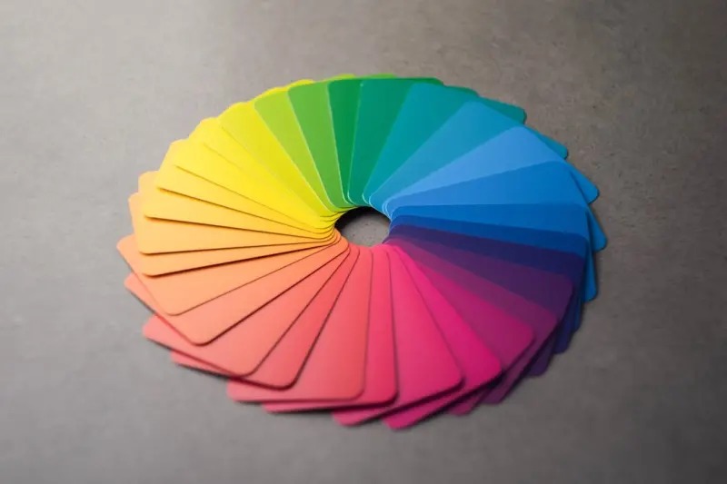
The Psychology of Color: How Emotion-Driven Design Boosts Ecommerce Sales
Discover how the science of color can transform your ecommerce site into an emotion‑driven sales e... Read More

Beyond the Screen: How Augmented Reality Is Reshaping Ecommerce Design
Augmented reality bridges the gap between digital product pages and real‑world experience, reducin... Read More

The Silent Architecture of Trust: How Visual Design Fuels Ecommerce Conversions
A deep dive into the visual strategies that silently build shopper trust—from color psychology and... Read More
Top Posts

Accessibility‑First Ecommerce: Boost Sales & Compliance
An accessibility‑first approach to ecommerce development unlocks new revenue, enhances performance, and ensures legal compliance. This guide offers actionable...Read More

Compliance‑First Self‑Hosted Ecommerce: Owning Data, Building Trust
A compliance‑first approach to self‑hosted ecommerce gives you control over data residency, reduces legal risk, and creates trust signals that boost convers...Read More

Serverless Hosted Ecommerce: Scaling Fast, Cutting Costs, and Future‑Proofing Your Store
Serverless hosted ecommerce replaces traditional VM‑based hosting with on‑demand functions, delivering faster page loads, pay‑as‑you‑go pricing, and a...Read More

Data Sovereignty and Composable Commerce: A Self‑Hosted Playbook for B2B Brands
A deep dive into why owning your ecommerce data matters, how composable commerce unlocks flexibility, and what steps B2B brands can take to future‑proof their...Read More
0 Comments
Post Comment
You will need to Login or Register to comment on this post!