
Why Micro‑Interactions Matter More Than You Think
When you walk into a physical store, you notice the subtle cues that guide you: a gentle chime when a door opens, a light that brightens as you approach a product, or a smooth drawer that slides out without a hitch. Those tiny moments shape your perception of the brand, often without you even realizing it. In the digital realm, micro‑interactions play the same role. They are the brief, purposeful animations or feedback loops that happen when a user clicks a button, adds an item to the cart, or hovers over a product image. In ecommerce design, these seemingly insignificant details can be the difference between a bounce and a purchase.
The Anatomy of a Micro‑Interaction
A well‑crafted micro‑interaction typically consists of four components:
- Trigger – The user action that initiates the interaction (e.g., clicking “Add to Cart”).
- Rules – The logic that determines how the system should respond (e.g., showing a confirmation toast).
- Feedback – The visual or auditory response that tells the user something happened (e.g., a subtle bounce animation).
- Loops & Modes – How the interaction behaves over time, including repeatability and state changes (e.g., disabling the button after a successful add).
When each piece is thoughtfully designed, the whole experience feels intentional and reassuring. When any element is missing, the journey feels clunky, and confidence erodes.
Micro‑Interactions vs. Big‑Picture Design
Many design teams pour resources into overarching layout, color palettes, and typography, which are undeniably important. However, the real magic happens in the margins—those fleeting moments that reinforce brand personality and guide behavior. Consider these two scenarios:
- Scenario A: A shopper clicks “Add to Wishlist.” The button instantly changes color, a tiny heart fills, and a brief “saved!” tooltip slides up. The user feels acknowledged, and the action becomes repeatable.
- Scenario B: The same click results in a static page reload with no visual cue. The shopper wonders if the click registered, potentially abandoning the wishlist feature altogether.
Both pages may share the same grid system, font choices, and product photography, yet the micro‑interaction in Scenario A creates a sense of trust and delight that Scenario B lacks.
Designing for Different Devices
Mobile devices dominate ecommerce traffic, and micro‑interactions must adapt to varying screen sizes and input methods. Here are a few mobile‑centric best practices:
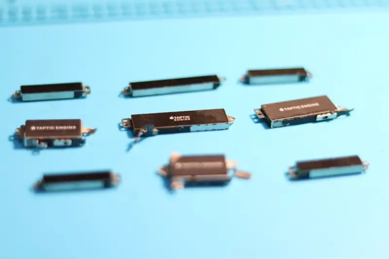
- Touch‑Friendly Feedback – Use haptic responses or subtle vibrations on supported devices to reinforce actions.
- Performance First – Keep animations lightweight (under 200 ms) to avoid jank, which can frustrate users on slower connections.
- Contextual Visibility – On smaller screens, avoid overloading the user with too many concurrent animations; prioritize the most critical feedback (e.g., cart updates).
On desktop, you have a bit more breathing room for richer animations, but the principle remains the same: feedback should be immediate, unobtrusive, and purposeful.
Psychology Behind Micro‑Interactions
Human beings are wired to notice change. When something moves, lights up, or makes a sound, our brain registers it as a signal that something important has happened. Leveraging this natural response can improve conversion rates in three key ways:
- Reinforcement – Positive feedback reinforces the behavior you want to repeat, such as adding items to the cart.
- Reduced Cognitive Load – Clear visual cues eliminate the need for the user to guess the outcome of an action, speeding up decision‑making.
- Emotional Connection – Delightful animations trigger dopamine releases, creating a subtle emotional bond with the brand.
Micro‑Interactions as Trust Builders
Trust is the cornerstone of ecommerce, especially for new or high‑ticket purchases. A well‑timed micro‑interaction can signal that the platform is secure and reliable. For example:
- When a user enters a credit‑card number, a green checkmark appears instantly once the number passes Luhn validation.
- During checkout, a progress bar that subtly fills with each step reassures shoppers they are moving forward.
- When a password is entered incorrectly, a gentle shake animation indicates an error without resorting to harsh alerts.
These cues are low‑cost, high‑impact methods to reduce friction and build confidence.
Integrating Micro‑Interactions with a design system
Creating micro‑interactions in isolation leads to inconsistency. A design system provides a reusable library of interaction patterns, ensuring that a “success toast” looks and behaves the same across product pages, search results, and account dashboards. Benefits include:
- Scalability – Developers can drop in predefined components without reinventing the wheel.
- Brand Cohesion – Uniform motion curves, easing functions, and durations reinforce brand identity.
- Speed to Market – Teams iterate faster because they’re working from a vetted set of micro‑interaction primitives.
When building a new feature, start by checking the design system. If the needed interaction doesn’t exist, add it back to the library for future use. This cycle creates a virtuous loop of continuous improvement.
Micro‑Interactions in a headless commerce environment
Headless architectures decouple the front‑end presentation layer from the back‑end commerce engine, granting designers unprecedented freedom. However, that freedom also means the responsibility for micro‑interactions shifts more squarely onto the front‑end team. Here’s how to stay organized:
- Component‑First Approach – Treat each micro‑interaction as a self‑contained component with its own state logic.
- API‑Driven Triggers – Use real‑time API responses to drive feedback (e.g., show a “stock low” animation when the inventory endpoint returns
quantity < 5). - Edge‑Ready Delivery – Serve interaction assets from a CDN edge node to minimize latency, ensuring the animation feels instantaneous.
By aligning micro‑interaction design with headless principles, you create experiences that are both fast and deeply personalized.
Practical Checklist for Auditing Your Site’s Micro‑Interactions
Before you launch a redesign, run through this checklist to catch gaps:
- All primary actions have feedback – Add‑to‑cart, wishlist, sign‑up, checkout, and error states.
- Consistent motion language – Same easing, duration, and spring values across the site.
- Accessible – Ensure animations respect reduced‑motion preferences and provide ARIA live regions for screen readers.
- Performance‑tested – Use Chrome DevTools Lighthouse to confirm animations stay under 50 ms on the main thread.
- Device‑responsive – Verify micro‑interactions work on touch, mouse, and keyboard navigation.
Case Study: From Static to Sensory
A mid‑size fashion retailer noticed a 12 % drop in cart conversion after moving from a monolithic platform to a headless stack. Their new UI was sleek, but it lacked the tactile feedback users were accustomed to. By introducing three key micro‑interactions—a bounce animation on “Add to Cart,” a slide‑up toast for “Item saved to Wishlist,” and a subtle progress bar during checkout—they recovered 8 % of the lost conversions within a month. The ROI was clear: a modest investment in motion design yielded a measurable boost in revenue.
Tools of the Trade
Implementing micro‑interactions doesn’t require a full‑blown animation studio. Here are some lightweight tools that integrate nicely with modern front‑end stacks:
- Framer Motion – React‑first library for declarative animations.
- LottieFiles – JSON‑based vector animations that render natively on web and mobile.
- CSS @keyframes – For simple, performant animations without JavaScript overhead.
- Storybook – Document and test micro‑interaction components in isolation.
Balancing Delight with Discipline
While it’s tempting to sprinkle every button with sparkle, restraint is key. Over‑animation can distract, increase page weight, and even trigger motion‑sickness for some users. Follow these guiding principles:
- Purpose First – Every animation must serve a functional goal, not just aesthetic flair.
- Speed Matters – Keep interactions snappy; aim for sub‑200 ms response times.
- Respect Preferences – Honor the
prefers-reduced-motionmedia query to accommodate users with motion sensitivities. - Iterate Based on Data – Use A/B testing to confirm that a micro‑interaction positively impacts key metrics (e.g., add‑to‑cart rate).
Future‑Proofing Your Micro‑Interaction Strategy
As AI‑driven personalization becomes mainstream, micro‑interactions will evolve from static feedback to dynamic, context‑aware experiences. Imagine an “Add to Cart” animation that subtly changes color based on the shopper’s browsing history, indicating “high‑value item” or “frequent purchase.” To prepare:
- Build a semantic token system for colors, easing, and timing that can be programmatically adjusted.
- Expose interaction parameters through your API layer so front‑end logic can adapt in real time.
- Maintain a design‑ops pipeline that automatically updates component libraries when new interaction tokens are added.
By treating micro‑interactions as data‑driven assets, you position your ecommerce site to scale alongside emerging AI capabilities.
Takeaway
Micro‑interactions are the quiet workhorses of ecommerce design. They reinforce trust, reduce cognitive friction, and inject a dose of delight that can tip a hesitant shopper over the conversion line. By embedding these tiny experiences within a robust design system, aligning them with headless architecture, and constantly testing their impact, you create a site that feels alive, trustworthy, and uniquely yours. The next time you think about redesigning a product page, start with the smallest interaction—because sometimes, the tiniest motion makes the biggest impression.

Robert Mathews is a professional content marketer and freelancer for many SEO agencies. In his spare time he likes to play video games, get outdoors and enjoy time with his family and friends .
Related Posts
Beyond the Checkout: Crafting a Post‑Purchase Experience That Turns Buyers into Fans
The real battle for ecommerce loyalty starts after the “Thank you” page. Learn how to use sound,... Read More

Designing Trust: Visual Tactics to Slash Cart Abandonment
Explore how strategic visual design—security badges, high‑quality images, social proof, and neur... Read More

When Pixels Meet Feelings: A New Playbook for Emotional Ecommerce Design
Learn how to infuse genuine emotion into every element of your ecommerce site—from color choices a... Read More
Top Posts

Data Sovereignty Made Simple on Managed Commerce Platforms
A deep dive into multi‑region tenancy, compliance auditing, and AI‑augmented privacy tools shows why modern managed commerce platforms are the key to unlock...Read More

Data Mesh: The Next Evolution for Scalable B2B Ecommerce
A Data Mesh transforms fragmented B2B ecommerce data into a decentralized, real‑time network, enabling faster insights, dynamic pricing, and scalable growth. ...Read More

Why Omnichannel is the New Frontier for Headless Commerce
Why Omnichannel is the New Frontier for Headless Commerce When I first heard the term “headless,” my mind jumped straight to the image of a decoupled storef...Read More

Hosted Ecommerce: The Launchpad for Global Market Wins
Hosted ecommerce platforms provide built‑in localization, scalable performance, and AI personalization, turning global market entry from a daunting project in...Read More
0 Comments
Post Comment
You will need to Login or Register to comment on this post!